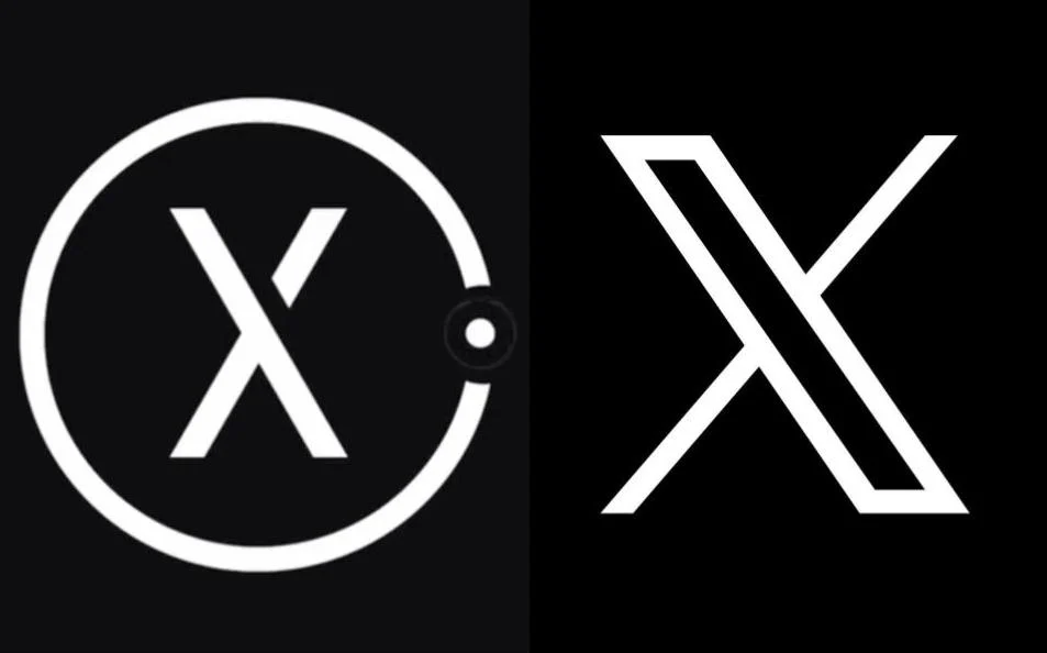
A Yorkshire-based augmented reality (AR) company has claimed Elon Musk’s Twitter rebrand has raised eyebrows over the similarities between its logo and the one recently chosen by the tech billionaire.
Peel X, which develops AR technology for digital storytelling and tourism experiences, told UKTN that clients have flagged the similarities between the two logos and that they “suspect some think we copied [X]”.
Twitter in July changed its name to X in a rebranding move from owner Musk that saw the iconic blue bird logo replaced with a stylised letter x.
Peel X said it has been using its logo since August 2022 and is an example of how “Yorkshire does great things first”.
However, Peel X said it doesn’t plan to take legal action given the size of the Silicon Valley company.
“So many clients have brought up the likeness of our company identity to X. I suspect some think we copied them and in the future we may have to rebrand,” said Jessica Wright, managing director of Peel X.
“But we’ve had this branding for over a year. In terms of legalities, we’re obviously not going to go up against Twitter, but maybe it goes to show that just like our athletes, and famous writers, Yorkshire does great things first.”
Founded in 2012, Peel X’s products include 3D renderings of physical environments from the past, which can be experienced by visitors at attractions.
‘David vs Goliath’
Sarah Talland, a chartered trademark attorney at Potter Clarkson, told UKTN that Peel X “appears to be the earlier user, having launched its branding over a year ago compared with Twitter’s rebrand to X taking place in July this year”.
Talland said that this meant under UK law, the Yorkshire company would have “earlier unregistered rights which they could use to defend their position but also to challenge Twitter/X’s use if they needed to”.
However, Talland noted that “challenging a large company such as X (formerly Twitter) is not easy”.
Rhys Merrett, head of technology at the PR agency the PHA Group, told UKTN that “logo copying is a regular occurrence” and that big brands have been in “hot water” in the past for using a logo which has” unquestionable resemblance to an existing business”.
In the case of Peel X, Merrett said it is a “daunting scenario, one that conjures a David vs. Goliath unfolding”.
Observers have previously flagged that X’s new branding looks similar to a generic Unicode character known as “mathematical double-struck capital X” that was added to the Unicode in March 2001.
These characters are available for use by anyone “without restriction,” a Unicode Consortium spokesperson Katherine Clark confirmed to The Verge.
UKTN has reached out to Twitter/X for comment.